How to Choose the Perfect Color Palette for Your Home
Learn how to choose the perfect color palette for your home with simple design tips. Discover how to combine colors, create balanced rooms, and build a beautiful color scheme that makes your space feel stylish and welcoming.
2/11/20265 min read
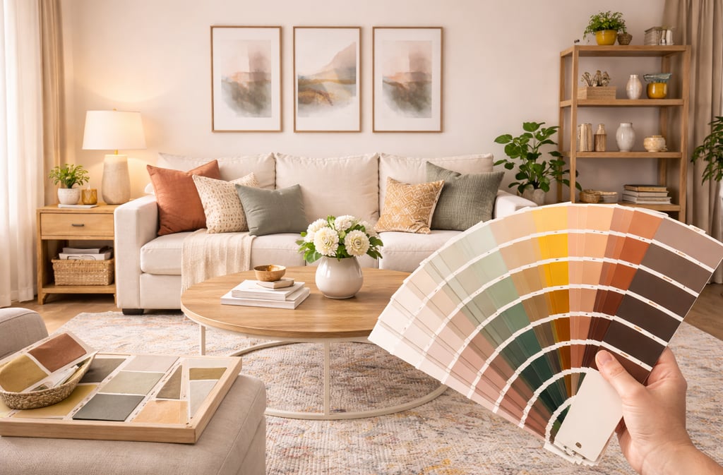
Color is one of the most powerful design tools you can use in your home. The right color palette can completely transform how a space looks and feels. It can make a room feel calm and relaxing, bright and energetic, or warm and inviting.
When colors work well together, your entire home feels more cohesive and thoughtfully designed. But choosing the right combination of colors can sometimes feel overwhelming. With so many shades available, it’s easy to feel unsure about where to begin.
The good news is that you don’t need to be an interior designer to create a beautiful color palette. With a few simple guidelines and a little inspiration, you can choose colors that complement each other and reflect your personal style.
Small design changes can make a big difference.
Whether you're refreshing a single room or updating your entire home, these tips will help you choose a color palette that makes your space feel balanced, welcoming, and uniquely yours.
Let’s transform your space.
1. Start with a Neutral Foundation
One of the easiest ways to build a beautiful color palette is by starting with neutral tones.
Neutral colors create a calm foundation that allows other colors and design elements to stand out without overwhelming the space.
Some of the most popular neutral shades include:
Soft white
Cream
Beige
Light gray
Warm taupe
These tones work beautifully on walls, large furniture pieces, and flooring.
Neutral colors help make rooms feel brighter and more open because they reflect light instead of absorbing it. This is especially helpful in smaller rooms or spaces that don’t receive much natural light.
Another benefit of using neutral colors is flexibility. Because neutrals pair well with many other colors, you can easily change your decor over time without needing to repaint your entire room.
A neutral foundation gives your home a timeless and balanced appearance while allowing accent colors to shine.
2. Choose One or Two Accent Colors
Once you have a neutral base, the next step is selecting accent colors.
Accent colors bring personality, warmth, and energy into your space. They add visual interest and help prevent rooms from feeling flat or overly simple.
Accent colors usually appear in smaller design elements such as:
Throw pillows
Area rugs
Curtains
Decorative vases
Artwork
Choosing one or two main accent colors helps keep the room feeling cohesive.
For example, a living room with neutral furniture might incorporate deep navy and warm gold accents. A bedroom might feature soft blush tones paired with muted green.
When used thoughtfully, accent colors create contrast while still maintaining harmony throughout the space.
3. Think About the Mood You Want to Create
Color doesn’t just affect how a room looks—it also influences how it feels.
When choosing a color palette, think about the mood you want each room to create.
Different colors can evoke different emotions.
For example:
Bedrooms often benefit from calming colors such as soft blue, sage green, or warm neutrals because these shades promote relaxation.
Living rooms can include slightly richer tones like warm beige, navy blue, or earthy terracotta to create a welcoming and comfortable atmosphere.
Kitchens often look beautiful with fresh colors such as white, light gray, or pale green, which make the space feel clean and bright.
By choosing colors that support the purpose of each room, you create spaces that feel both functional and enjoyable.
4. Find Inspiration in Nature
Nature provides some of the most beautiful color combinations.
If you’re unsure which colors work well together, looking at natural landscapes can be a great starting point.
For example, a beach-inspired palette might include:
Sandy beige
Pale blue
Crisp white
A forest-inspired palette might combine:
Deep green
Warm wood tones
Soft brown accents
These combinations often feel balanced and calming because they already exist in the natural world.
Using nature as inspiration can help simplify the process of choosing colors for your home.
5. Follow the 60-30-10 Design Rule
Interior designers often use a simple guideline known as the 60-30-10 rule when creating color palettes.
This rule helps maintain balance within a room.
Here’s how it works:
60% of the room should feature the dominant color, which is usually the wall color or large furniture pieces.
30% of the room should include a secondary color, often seen in upholstery, curtains, or rugs.
10% of the room should be the accent color, which appears in smaller decor items.
For example, a living room palette might include:
60% soft white walls
30% beige furniture
10% deep green accents
This balance helps the room feel visually interesting while still maintaining harmony.
6. Test Colors Before Committing
Paint colors can look very different in your home than they do in a store.
Lighting, furniture, flooring, and natural sunlight can all affect how a color appears once it’s on your walls.
Before committing to a paint color, it’s always a good idea to test a sample first.
Paint a small section of the wall and observe how the color looks at different times of the day.
Morning sunlight, afternoon brightness, and evening lighting can all change how the color appears.
Testing colors first helps you avoid costly mistakes and ensures you choose a shade that truly works in your space.
7. Consider the Flow Between Rooms
When choosing colors for your home, it’s important to think about how rooms connect with one another.
Using a cohesive palette throughout your home creates a sense of harmony.
This doesn’t mean every room must be painted the same color. Instead, choose colors that complement each other.
For example, if your living room features warm beige tones, the adjacent room might include soft gray or muted green.
Repeating certain accent colors throughout your home can also help tie different spaces together.
This approach creates visual flow while still allowing each room to have its own personality.
8. Balance Warm and Cool Tones
Colors are often categorized as warm or cool.
Warm tones include colors such as:
Red
Orange
Yellow
Warm beige
Cool tones include colors like:
Blue
Green
Gray
Cool white
Balancing warm and cool tones helps prevent a room from feeling too cold or too heavy.
For example, if your walls are painted in a cool gray tone, adding warm wood furniture or beige textiles can create balance.
This combination keeps the space feeling comfortable and visually interesting.
9. Add Color Through Decor and Accessories
Not every color in your palette needs to appear on your walls.
In fact, some of the most beautiful color combinations appear through decor items instead.
Adding color through accessories allows you to experiment with different shades without making permanent changes.
You can introduce color through items such as:
Pillows
Rugs
Curtains
Artwork
Decorative bowls
This approach also makes it easier to refresh your space when your style evolves.
Decor pieces give you flexibility while still maintaining a cohesive design.
10. Trust Your Personal Style
Design rules can provide helpful guidance, but your home should ultimately reflect your personal style.
Choose colors that make you feel comfortable and inspired.
If you love bold colors, consider using them as accent walls or decor pieces.
If you prefer light and airy spaces, stick with soft neutral tones and subtle accents.
Your home should feel like your favorite place in the world.
When your color palette reflects your personality, your space will naturally feel more welcoming and authentic.
Final Thoughts
Choosing the perfect color palette for your home doesn’t have to be complicated.
By starting with neutral tones, adding thoughtful accent colors, and considering the mood of each room, you can create a color scheme that feels balanced and beautiful.
Testing colors, drawing inspiration from nature, and maintaining visual flow between rooms can help your entire home feel cohesive.
Small design changes can make a big difference.
When colors work together thoughtfully, your home becomes a space that feels calm, welcoming, and uniquely yours.
And with the right palette, every room can feel like a place you truly love spending time in.